
Welcome to our guide on using Seaborn in Python for creating stunning seaborn heatmaps. It focuses on practical insights, particularly in finance, and provides a step-by-step approach to generating heatmaps. It perfectly guides you through the intricacies of Seaborn for Python data visualization with an emphasis on creating compelling and insightful heatmaps.
Whether you're a finance aficionado seeking to unlock the secrets of market trends or a data enthusiast eager to transform raw information into visually striking patterns, this blog is your gateway to mastering Seaborn's heatmap prowess.
Dive deep into the core of our exploration, where we unravel the fundamental question: What is a heatmap, and why has it become an indispensable tool in the realm of data visualization?
From its conceptual origins to real-world applications, we illuminate the path for you to wield this visualization technique with precision.
Explore alternative Python libraries for plotting heatmaps, expanding your options for future projects in addition to Seaborn heatmap creation. The primary goal is to help you effectively use Seaborn to visualize single-day percentage price changes of stocks and explore correlations among these changes.
We cover the basics, such as understanding what a heatmap is, and then delve into specific use cases within the financial domain. The tutorial includes clear Python code for each step, making it accessible for both beginners and those looking to enhance their data visualization skills. Additionally, we'll touch on alternative Python libraries for plotting heatmaps, broadening your options for future projects.
Our aim is to equip you with the knowledge and practical skills needed to leverage Seaborn heatmap creation effectively. This is your ticket to becoming a maestro in the art of seaborn heatmaps!
Let's dive into the world of Seaborn and enhance your proficiency in Python data visualization, particularly in creating compelling and insightful Seaborn heatmaps. Our roadmap for this blog is:
- Seaborn for Python Data Visualization
- What is a Heatmap?
- Use Cases for Heatmaps in Finance
- Step-by-Step Python Code for Creating Seaborn Heatmaps
- Seaborn Heatmap to display the Single-Day Percentage Price Changes of Stocks
- Seaborn Heatmap to display the Correlation Among the Price Changes of Stocks - Other Python Libraries for Plotting Heatmaps
In our previous blog, we talked about Data Visualization in Python using Bokeh. We now turn our eye towards another cool data visualization package in Python.
Seaborn for Python Data Visualization
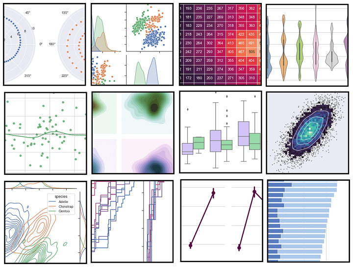
Seaborn ⁽¹⁾ is a data visualization library based on Matplotlib, offering a high-level interface for drawing attractive statistical graphs, including various types such as distribution plots, regression plots, and Seaborn heatmaps.
Seaborn is built on top of Matplotlib, and its graphics can be further tweaked using Matplotlib tools and rendered with any of the Matplotlib backends to generate publication-quality figures.
The types of plots that can be created using Seaborn include:
- Distribution plots
- Regression plots
- Categorical plots
- Matrix plots
- Time series plots
- Heatmaps
A to Z of Careers in Algorithmic Trading
15 min read
The plotting functions operate on Python (Python for Trading) data frames and arrays containing a whole dataset and internally perform the necessary aggregation and statistical model-fitting to produce informative plots. Some examples can be found here.
What is a Heatmap?
A heatmap is a two-dimensional graphical representation of data where the individual values that are contained in a matrix are represented as colours.
The Seaborn package allows the creation of annotated heatmaps which can be tweaked using Matplotlib tools as per the creator’s requirement.
Use Cases for Heatmaps in Finance
Heatmaps in finance provide powerful visualization for comparing various entities, such as comparing the price changes and returns of multiple assets. It is easy to create and customize, and intuitive to interpret. Thus, Seaborn heatmaps are extensively used in dealing with multiple assets in finance.
Some of the important use-cases where heatmaps provide powerful visualization are:
- Comparing the price changes, returns, etc. of various assets
- Checking the correlation among multiple stocks
Since heatmaps provide us with an easy tool to understand the correlation between two entities, they can be used to visualize the correlation among the features of a machine learning (Machine Learning for Trading) model. This may help in feature selection by eliminating highly correlated features.
How to make a Career in Algorithmic Trading
15 min read
Step-by-Step Python Code for Creating Seaborn Heatmaps
Let us now look at a couple of these use cases and see how we can create Python code for them using Seaborn heatmap.
Seaborn heatmap to display the single-day percentage price changes of stocks
We will create a Seaborn heatmap for a group of 30 pharmaceutical company stocks listed on the National Stock Exchange of India Ltd (NSE). The Seaborn heatmap will display the stock symbols and their respective single-day percentage price change.
We collate the required market data on pharma stocks and construct a comma-separated value (CSV) file comprising of the stock symbols and their respective percentage price change in the first two columns of the CSV file.
Since we have 30 pharma companies on our list, we will create a heatmap matrix of 6 rows and 5 columns. Further, we want our Seaborn heatmap to display the percentage price change for the stocks in descending order.
To that effect, we arrange the stocks in descending order in the CSV file and add two more columns that indicate the position of each stock on the X & Y axis of our heatmap.
Step 1 - Import the required Python packages
We import the following Python packages:
Step 2 - Load the dataset
We read the dataset using the read_csv function from pandas and visualize the first ten rows using the print statement.
    Symbol  Change Yrows Xcols
0   BIOCON   3.18    1     1
1   SYNINT   2.45    1     2
2   DRREDD   1.80    1     3
3   TORPHA   1.48    1     4
4      FDC   @.75    1     s
5    DRLAL   @.56    2     1
6   INDREM   @.26    2     2
7   ABBIND   6.04    2     3
8   GRANUL   6.00    2     4
9   GLAPHA  -@.44    2     5
A to Z of Careers in Algorithmic Trading
15 min read
Step - 3 Create a Python Numpy array
Since we want to construct a 6 x 5 matrix, we create an n-dimensional array of the same shape for “Symbol” and the “Change” columns.
[[’BIOCON’ ‘SYNINT’ ‘DRREDD' ‘'TORPHA’ ‘FDC']
[’DRLAL’ ‘INDREM' ‘ABBIND’ ‘GRANUL’ ‘GLAPHA’]
[‘DIVLAB’ ‘GLEPHA' ‘CIPLA’ ‘SANOFI’ ‘IPCLAB’]
['APOHOS’ "NARHRU' ‘STRSHA' ‘ORCPHA' ‘OPTCIR']
['JUBLIF’ ‘PFIZER’ ‘CADHEA’ ‘LUPIN’ ‘WOCKHA’]
['SUNPHA’ ‘FORHEA' ‘THYTEC' ‘AJAPHA’ ‘AURPHA’]]
[[ 3.18  2.45  1.8   1.48  0.75]
 [ 0.56  0.2   0.04  0.   -0.04]
 [-0.05 -0.11 -0.12 -0.22 -0.3 ]
 [-0.31 -0.43 -0.49 -0.52 -0.53]
 [-0.63 -0.85 -0.89 -0.91 -0.93]
 [-1.12 -1.24 -1.8  -1.94 -3.2 ]]
Step 4 - Create a Pivot in Python
The pivot ⁽²⁾ function is used to create a new derived table from the given data frame object “df”. The function takes three arguments; index, columns, and values. The cell values of the new table are taken from the column given as the values parameter, which in our case is the “Change” column.
Xcols   1    2     3     4     5
Yrows
  1   3.18  2.45  1.86  1.48  0.75
  2   0.56  0.20  0.04  6.40 -0.04
  3  -0.05 -0.11 -0.12 -0.22 -0.30
  4  -0.31 -0.43 -0.49 -0.52 -0.53
  5  -0.63 -0.85 -0.89 -0.91 -0.93
  6  -1.12 -1.24 -1.80 -1.94 -3.20
Step 5 - Create an array to annotate the heatmap
In this step, we create an array that will be used to annotate the Seaborn heatmap. We call the flatten method on the “symbol” and “percentage” arrays to flatten a Python list of lists in one line.
The zip function which returns an iterator zips a list in Python ⁽³⁾. We run a Python For loop and by using the format function; we format the stock symbol and the percentage price change value as per our requirement.
A Guide to Careers in Algorithmic Trading
15 min read
Step 6 - Create the Matplotlib figure and define the plot
We create an empty Matplotlib plot and define the figure size. We also add the title to the plot and set the title’s font size, and its distance from the plot using the set_position method.
We wish to display only the stock symbols and their respective single-day percentage price change. Hence, we hide the ticks for the X & Y axis, and also remove both the axes from the heatmap plot.
Step 7 - Create the heatmap
In the final step, we create the Seaborn heatmap using the heatmap function from the Seaborn package. The heatmap function takes the following arguments:
- data – a 2D dataset that can be coerced into a ndarray. If a Pandas DataFrame is provided, the index/column information will be used to label the columns and rows.
- annot – an array of the same shape as data which is used to annotate the heatmap.
- cmap – a Matplotlib colormap name or object. This maps the data values to the color space.
- fmt – string formatting code to use when adding annotations.
- linewidths – sets the width of the lines that will divide each cell.
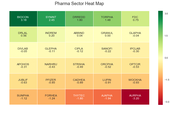
Here’s our final output of the Seaborn heatmap for the chosen group of pharmaceutical companies. Looks pretty neat and clean, doesn’t it? A quick glance at this heatmap and one can easily make out how the market is faring for the period.
A to Z of Careers in Algorithmic Trading
15 min read
Seaborn Heatmap to display the Correlation Among the Price Changes of Stocks
We have created a heatmap of the changes in the prices of various pharma stocks to see at a glance how they are doing. But, can we also check out if some stocks seem to be moving together and are correlated?
This would be useful in building a portfolio. Let us see how we can do this in Python using the Seaborn library.
Step 1 - Import the packages
Let us begin by importing the libraries that we need to use.
Step 2 - Setting the parameters
We now define the parameters required for us to pull the data from Yahoo, and the size of the plot, in case we want something different than the default.
Step 3 - Pulling the data
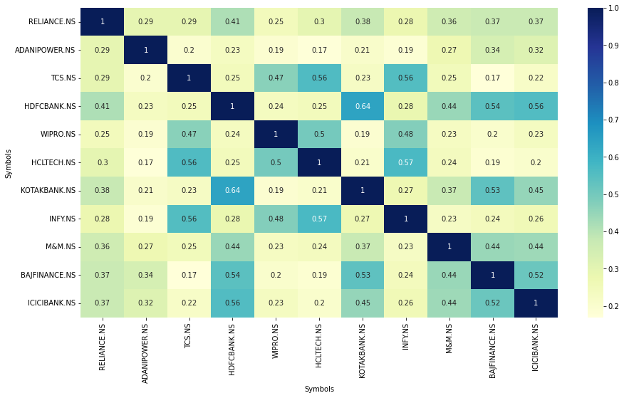
We now define a function to pull the data from Yahoo. Thereafter, we pass a list of the tickers for which we want to check correlation. Remember, if you pass a list of ‘n’ stocks, you will get a heatmap of ‘n X n’ dimensions. Hence, it is best to pass a limited number of tickers so that the heatmap does not become cluttered and difficult to read.
We will fetch only the adjusted close prices of these stocks.
Step 4 - Calculate the percentage returns of the stocks
We now calculate the percentage change in the adjusted close prices of the stocks.
Step 5 - Plot the correlation heatmap
We will now plot the correlation among the percentage returns of these stocks using the Seaborn library. As earlier, we define the color map we want to use for our plot, and set the annotations to True.
Here is our heatmap. As you can see, stocks belonging to the same sector are correlated. Are there any other interesting observations that you can make from this plot? Do let us know!
Make a Career in Algorithmic Trading
15 min read
Other Python Libraries for Plotting Heatmaps
Python has many libraries that provide us with the functionality to plot heatmaps, with different levels of ease and different visual appeal. Now that we have explored using the Seaborn library for plotting heatmaps, we are sure you want to explore using other Python libraries for plotting heatmaps in addition to Seaborn heatmap.
Here’s a list for you to sample:
- Matplotlib
- Plotnine
- Plotly
- Cufflinks
- Bokeh
Do let us know if you would like to read more about using these (and maybe other) libraries for plotting heatmaps on our blog. You will find it very useful and knowledgeable to read through this curated compilation of some of our top blogs on:
- Python for Trading
- Machine Learning
- Sentiment Trading
- Algorithmic Trading
- Options Trading
- Technical Analysis
A to Z of Careers in Algorithmic Trading
15 min read
Are you interested in creating your own Python trading bot and delving into the exciting world of algorithmic trading? Look no further! In this comprehensive video, we explore the ins and outs of algorithmic trading using Python, catering to both beginners and experienced traders alike.
Conclusion
As we've shown, Seaborn is an easy-to-use library that provides powerful tools for better and more aesthetic visualizations, especially when it comes to creating Seaborn heatmaps.
One can tweak the Seaborn plots to suit one’s requirement and make heatmaps using Python for various use cases. You can refer to the documentation of Seaborn for creating other impressive charts.
In case you are also interested in developing lifelong skills that will always assist you in improving your trading strategies. In our comprehensive algo trading course, you will be trained in statistics & econometrics, programming, machine learning and quantitative trading methods, so you are proficient in every skill necessary to excel in quantitative & algorithmic trading. Know more about the EPAT course now!
Downloadable files
Readers can download the entire Seaborn Python code plus the excel file using the download button provided below and create their own custom heatmaps.
A little tweak in the Python code and you can create Seaborn Python heatmaps of any size, for any market index, or for any period using this Python code. The Seaborn heatmap can be used in live markets by connecting the real-time data feed to the excel file that is read in the Python code.
Files in the download
- Pharma Heatmap using Seaborn - Python code
- Pharma Heatmap - Data excel file
- Correlation between stocks - Python notebook
Updated by Udisha Alok (Originally written by Milind Paradkar)
Note: The original post has been revamped on 18th May 2022 for accuracy, and recentness.
Disclaimer: All investments and trading in the stock market involve risk. Any decision to place trades in the financial markets, including trading in stock or options or other financial instruments is a personal decision that should only be made after thorough research, including a personal risk and financial assessment and the engagement of professional assistance to the extent you believe necessary. The trading strategies or related information mentioned in this article is for informational purposes only.

